WIP it! WIP it GOOD!

(copied from Patreon)

Yeah, yeah. I know. That title. Sorrynotsorry though.  Here's why:
I am surrounded by WIPs (Works in Process for any confused). I have no fewer than 8 pieces surrounding me now in various states of completion. Honestly,  coming up with ideas has never been much of an issue. Focusing and Finishing however, well... we all have our demons. And currently mine need some serious wrestli- oh look something shiny! 

  See what I did there? SHINY? SEE? Ok, so it's possibly I've been too many days in the studio drawing and not talking to people. But it does help my segue.  The above piece is my next to be properly finished. It just requires a few minor cleanups, pushes and pulls  but she's 95% there.  If any of my $3 and up Patrons want first dibs- let me know! I will likely put her up for sale framed for around $800. 

I'm pretty proud of this lady. She's the largest watercolor I've attempted in this style (absorbent ground on board with gold leaf) at 9 x 12. Sure, in the grand scheme that isn't super big but I'm scaling in baby steps.  Next step is trying something around 16 x 20 I think.  I'm so excited to dive into larger sizes that it's really hard to not go out and jump in on a new piece right now BUT. This is exactly the problem. I really need to finish some of the other pieces on my queue first.  In fact, I've currently narrowed it down to two that I want to push forward on next: 

This one is  a warm up sketch that got out of hand. (You can watch get done it in real time here  and here . )

I really like the design and can see this translating into either an oil OR watercolor piece very easily. IS it the right design for a 16 x 20? No... I don't think so but probably a 9 x 12 easy.

Then there is this piece:

Fun,  sort of stream of conscious oil sketch.

It's a palette departure for me which is GOOD. Not everything has to be blue.  I see some fun experiments in glazing layers in the future for this piece.

To see more posts like this and join the conversation, please consider supporting me on Patreon!


The Green Dream

"Jojen's eyes were the color of moss, and sometimes when he looked at you he seemed to be seeing something else. Like now. "I dreamed of a winged wolf bound to earth with grey stone chains," he said. "It was a green dream, so I knew it was true. A crow was trying to peck through the chains, but the stone was too hard and his beak could only chip at them."
"Did the crow have three eyes?"
Jojen nodded." -
from A Clash of Kings by George R.R. Martin

Several months ago Deb Freytag over at Fantasy Flight games reached out with a job that was too fun to refuse. She wanted a card for the upcoming Game of Thrones expansion but different from the usual art they commission. This was meant to depict a dream and so she needed a more dreamlike style and said that it seemed like a good fit for me. I couldn't pass up the chance to put what I've been exploring in my personal work into an illustration for one of my favorite series so of course I said yes. This ended up being one of the most enjoyable projects I've done with Fantasy Flight to date. I'm very grateful for Deb keeping my work in mind for such a project and giving me the chance to stretch this style into an illustration. I really enjoyed working on this piece and am excited to be able to share it now!

Below are some thumbnails and color studies for the piece. Since I knew the window in the card was going to be an oval, I tried to design the movement within the illustration to fit the shape. It was also fun experimenting with some dreamy color palettes I don't usually get to try in this context. 

Interior Illustrations for the Labyrinth of Flame

Last year I had the very good fortune to be asked to create interior illustrations for Courtney Schafer's book "The Labyrinth of Flame". This was the third book of a trilogy and, as such, Courtney wanted it to be something special. It's long been an ambition of mine to do interior illustrations, so I was thrilled to be asked to help bring Courtney's story to life. The world and characters she's created are richly developed and her storytelling fast paced and thrilling.  Illustrators don't always end up working with stories they would read anyways, but is It was a true pleasure to become absorbed with Courtney's adventure during this process. I'm truly grateful for her and her fans for supporting this project and my involvement.  You can purchase the book on Amazon.

Gorgeous cover by David Palumbo

Gorgeous cover by David Palumbo

And here are a few of the thumbnails:

THE BOOK OF LOVE AND FEAR

The Book of Love and Fear is coming!

Past: In 2013 I launched the very first Month of Love on blogspot with about 20 of my artist friends.  We committed to making art every day for the month, pushed and challenged ourselves and had had an amazing time. A few months later I switched the format to weekly, invited a bunch more people and the Month of Fear was born.

Present: 3 years later: We’ve changed platforms, welcomed many more artists from around the world, created hundreds of new works of art and won several collective awards with the resulting art. It’s time to celebrate our dedication and growth with a book collecting the best of our first few years. 

Future: In 2016, we plan to launch a Kickstarter to fund this book. We have the art, we have the designers, we even have some new content from the artists. All that’s left is putting everything together in a beautiful package, running the numbers and then inviting all of YOU to help us get this book born! 

JOIN! More details will be coming soon. But until then, please subscribe to our mailing list for updates on this project. I promise you won’t be spammed, you might even get some awesome super secret insider fun! Your support and participation are instrumental to this becoming a success.  You can also follow us on on Tumblr at:

 http://bookofloveandfear.com/
http://monthoffearart.com/
http://monthofloveart.com/

Thank you with all my Love and and my Fear,

Kristina Carroll

Questions? Email: bookofloveandfear (at) gmail.com

True Detective: Hart and Cohle


Hart and Cohle
Oil on Illustration Board
13" x 19"
True Detective was one of the most intense, smart and visually inspiring shows I have seen in a long time.  Even a year later, I find myself thinking about this show and it's probably about time I sat down for a rewatch. On top of the stunning cinematography, Woody Harrelson and Matthew McConaughey created two of the most fascinating and complex characters on TV.  Around the season finale last year, I began the first of these portraits with Rusty on the right as an oil demo for a class. I enjoyed it so much I kept working on it and then drew out a portrait of Marty Hart to go along. Unfortunately, as these things go, the paintings often got put aside so I could work on other things.  So it took me a while of working here and there between projects to get them finished. On top of that, I was trying some different experiments with texture and ended up playing around, starting over, trying new things, failing, starting over and then finally moving on. All in all, these were very fun to make and I can't wait to see the second season. 

Hart
Oil on Illustration Board
13" x 19" 

Cohle
Oil on Illustration Board
13" x 19"  

Every Day Original - Featured Artist Interview

As many of you know, for a couple month now I have had the good fortune to been one of the artists participating on Every Day Original. 

This online gallery the brainchild of Marc Scheff and Lauren Panepinto, the brilliant illustrator/AD team behind Drawn and Drafted. They have been working on many ways to engage, enliven and educate the community and I for one am very grateful for the incredible work they've done so far.

As part of the match-up between Month of Love and Every Day Original, Marc put together an interview for me as well. He asked some very good questions that really made me think. So  if you want to get a little more insight into my past, present and future- click on the image below to read more!


Month of Love 2015

Well another February has ended which means I have a bunch of new art from the 3rd annual Month of Love challenge!

A few things changed this year. I made a new website and switched platforms to Tumblr, which I think looks much nicer for our purposes. It was a really great year with some of the best overall quality of art yet! You can check out all the beautiful work, the challenges and the stories at http://monthofloveart.com/


I am also pleased that we were able to partner with Every Day Original this year and offer many of our originals for sale in one place! You can check them out at http://www.everydayoriginal.com/month-of-love/

Without further ado: here are my favorite pieces from this year's challenge:

Lady Nautilus and Companion
for the "Love is all Around" challenge
5 x 7 oil on panel
available for purchase from Every Day Original

"Lilith"
For the "Forbidden Fruit" challenge
5 x 7 oil on panel
available for purchase from Every Day Original 


"Halloween Jack"
For the "Diamonds" challenge
Watercolor

"Calamity's Child"
For the "Diamonds" challenge
Watercolor

"The Wolf and the Lamb"
For the "Love your Neighbor" challenge
16 x 20
charcoal
Some favorites by my friends. Clockwise from top left:
  Goni Montes, Wylie Beckert, Winona Nelson, Angela Rizza, Carly Mazur 

Month of Fear 2014

I only just realized I never posted all my 2014 Month of Fear work here!  Bad, bad artist. The 2nd annual Month of Fear was AMAZING. Truly the best art yet- I was so inspired! You can check out all the amazing images and challenges at monthoffear.com. 

I think I made some of my new personal favorite work with this year's challenge as well. So here are the images and if you want to read the full stories about them, check out my Month of Fear page here.

"Leviathan"
18 x 24 charcoal
For the 2014 Month of Fear challenge: Demons

"Rabbit"
18 x 24 charcoal
For the 2014 Month of Fear challenge: Things that go Bump

"False Muse"
18 x 24 charcoal
For the 2014 Month of Fear challenge: What are you Afraid of?


"Unmase"
18 x 24 charcoal
For the 2014 Month of Fear challenge: Masks

Arisia and Art Books


It has been a very busy couple of weeks with a lot of good news. Let's start with a couple of announcements:

I'm very excited to announce that the Inspired by ArtOrder challenge book is finally available for pre-order! Check it out here: http://www.theartorder.com/blog/inspiredartbook


Some of the amazing art in the book: left to right: Rebecca Yanovskaya, Wylie Beckert, Marc Scheff, Jon Picacio, Tara Larsen Chang, Kristina Carroll

I can't tell you how excited I am for this book. Not only is it a stunning group of artists and stories, Jon Schindehette did an exquisite job of putting it together. It's a very limited run- so don't miss out!

Speaking of books: I am honored to announce that I had three pieces accepted into the 3rd annual Infected By Art Book!

Leviathan
Charcoal 18 x 24

House of Leaves
Charcoal 18 x 24

Intelligent Design
Oil 6 x 6


There are so many wonderful artists in this and the judges for this annual were several people I have a great deal of admiration for, so it felt extra wonderful to get into this book. Thank you!

Also,  I had the pleasure of showing work in the Arisia Art Show this past week and had a great experience.  My good friend Lee Moyer was the Artist Guest of Honor and so it was extra great to get to see so much of his work (he had over 100 pieces in the show!) and catch up a bit with him.  But the good news doesn't stop there. I arrived at the show on Saturday to find a few surprised on my art: 


That's TWO awards! Frog Queen's Revenge won the Chairman's Choice award  and Dragonslayer Artist Guest of Honor award. (Lee had to run it by the committee. It's a common problem within this community, I think, as so many of us know each other already) 

And if that weren't enough, Dragonslayer found a new home with artist Max Martelli! (who had some lovely Lovecraftian pieces on the panel next to me) I was sort of sad to see it go as this is one of my favorite pieces but glad it has  found a new home with someone who enjoys it!

Max taking Dragonslayer home with him
So thank you Arisia, for being such an enjoyable experience! I will be doing Boskone's art show as well next month, so here's hoping for another good run! 

Finally: February is just around the corner which means, you guessed it, the 3rd annual Month of Love challenge! 


We have a shiny new website and an all-star roster of artists this year. Click on the banner to see what's new and how YOU can join.

Ok- that's all for now. Check back soon for more art and news!

Henneth Annûn Guard - Lord of the Rings card game

Henneth Annûn Guard
for the Celebrimbor's Secret adventure pack
Digital
Doing card art is always an exercise in patience and changing taste. When it can take nearly a year for an image to be released, that's a lot of time to fall out of love with the art for any number of reasons.  Still, this piece I did for the Lord of the Rings card game was a lot of fun to work on and there is still a lot I like about it. So I unearthed some of my process to share!

One thing I enjoy about working with Zoe Robinson at Fantasy Flight (apart from LotR being one of the reasons I am an illustrator period)  is the descriptions. I love this world and whenever it's applicable, they will include a quote from the books in the art description. Nothing like the words of Tolkien to inspire! 
" They stood on a wet floor of polished stone, the doorstep, as it were, of arough-hewn gate of rock opening dark behind them. But in front a thin veilof water was hung, so near that Frodo could have put an outstretched arminto it. It faced westward. The level shafts of the setting sun behind beatupon it, and the red light was broken into many flickering beams ofever-changing colour. It was as if they stood at the window of someelven-tower, curtained with threaded jewels of silver and gold, and ruby,sapphire and amethyst, all kindled with an unconsuming fire."
The card description called for  a ranger of Ithilien standing guard in the entrance to Henneth Annûn
wearing a cloak and a sheathed sword.  Thinking back to the book, I remembered how ready for action and suspicious the rangers were and knew that this character would never be relaxed. Even if he'd been standing alone for hours, he would be ready at every suspicious sound. I wanted the entrance to be prominent, as if the next moment would bring someone or something crashing through. I also knew this would be a fun opportunity to play with some dramatic negative shapes and light. 

thumbnail 1

thumbnail 2

thumbnail 3
thumbnail 4 -
the winner

mood study

I knew I wanted to convey a dark, cool mood and was leaning toward a very limited palette. However, I soon realized, with some helpful feedback from Zoe, that this wouldn't be so effective on the small, card scale so ended up bumping up the palette and contrast so the figure would read clearly.


detail
I'm a traditional girl at heart and do it whenever I can but often find that my schedule makes choosing digital for either part or the whole project a better path. Time that I would spend waiting for things to dry, photographing, color correcting, I can spend on making a better image.  I really wanted to play around with color in the shadows and subtle light shifts in the character and going digital gave me the chance to experiment and push those choices with more flexibility. Thank you again Zoe for the opportunity to contribute to one of my favorite all-time worlds!


Month of Fear 2014


So things have been pretty quiet on the blog this month because once again I've been coordinating the Month of Fear challenge for October. Head over to monthoffear.com to see tons of amazing art from nearly 50 artists this round! You can also follow us on Twitter. It's the biggest one yet!

Adventures in Charcoal - Prologue

Minotaur quickie sketch
powdered charcoal, charcoal pencil

Let me start by saying I love the internet. Social Media, while still massively flawed in many ways, does make it so easy to share information instantly and start a conversation with a ton of people.  A few weeks ago I put out a call on Facebook for input on charcoal brands. I've been loving the charcoal lately and  now that I am getting more comfortable with it, decided I needed to do some serious testing of the different options to up my game. Namely I wanted to find a charcoal with a smoother and more consistent application than what I have been using.   I got some great suggestions and immediately took advantage of all the Dick Blick back to school sales and free shipping to fill out my burnt wood collection. Charcoal is a very tricky mistress. She's messy and flexible which is what makes her fun but a little hard to control sometimes. 

So in the spirit of art and the scientific method: I bring you Adventures in Charcoal! (feel free to hum some dramatic music)

Here are a bunch of my new (and some old)  toys I will be playing with :

It's like Christmas! I must have been very, very naughty to get all this coal. 

 The new players: 

Alphacolor charkoles recommended by Bill Carman

Coates recommended by Scott  and Teresa Fischer


Pan Pastels recommended by Eric Braddock and Dale Stephanos
Eric used these on his amazing Lord of the Rings drawings.

Nitram recommended by Robert Hunt

I really wanted to play with some of those big sticks, so tried out a quick experiment with the Nitram charcoals right away with this self portrait below.


Self Portrait
18 x 24
nitram charcoal on 300 series Strathmore charcoal paper
Right off the bat I noticed that the Nitram holds onto the paper better than a typical vine charcoal.  Often I prefer the 300 series charcoal pad from Strathmore because it has slightly less tooth and so I can float the charcoal on top a little easier, move it around with a brush or chamois and erase to white. The flipside to that is building up darks gets tricky. But with the Nitram I can build it up a bit thicker, get some darker colors and still erase. It doesn't go on quite as smooth as a soft vine charcoal but is still pretty consistent. Plus the larger. firmer sticks really lend themselves to filing into useful shapes which I will discuss more in a later post.

Over the next several weeks I will be experimenting with all of these more and posting my results. So please stay tuned and let me know if you have your own tips and tricks!

Figurative Friday 6 - Self Portrait

It's been a while since I did a proper self portrait from life and it was about time I captured the crazy hair anyways. Plus, I just got a huge supply of new charcoal toys to play with and couldn't wait to try some out . I will talk more in depth about the different brands and how they are to use in a later post but so far  the Nitram is quite lovely.
Nitram Charcoal on Strathmore 300 series pad


Figurative Friday 5 - Sam

Sam modeled for my Frog Queen piece last year. She was a great model  but I knew I was going to end up changing her likeness a bunch for the piece, so grabbed some normal shots of her as well for myself.  A while back I wanted to test out some new oil colors and some palette ideas so grabbed one of the photos for inspiration and did this little study.

Sam
Oil on Panel
8 x 12

Richard Estes, Evolutions in Taste, and Stealing

"I think the popular concept of an artist is a person who has this great passion and enthusiasm and super emotion. He just throws himself into this great masterpiece and collapses from exhaustion when it's finished. It's really not that way at all. Usually it's a pretty calculated, sustained and slow process by which you develop something. The effect can be one of spontaneity but that's part of the artistry... I think the real test is to plan something and be able to carry it out to the very end. Not that you're always enthusiastic; it's just that you have to get this thing out. It's not done with one's emotions; it's done with the head."
- Richard Estes

One of the wonderful things about the art path is constantly seeing new things as you grow. It's  impossible to become stagnant and bored if you are paying attention and keeping an open mind. For instance: I used to hate the impressionists. I found their drawing lazy and their paintings lacked drama for me.  (Ironically, some of the same things  their contemporaries said about them) Then I started studying color theory and, most importantly, went to the Met to look at the art in person.

Rouen Cathedral: The Portal (Sunlight),
Claude Monet  1894
When I saw Monet's "Cathedral" it was like a light switched in on in my brain. The complexity of color that built up forms. The luminosity of the shadows. The soft edges and thick brushstrokes that made everything vibrate with life. It was beautiful. And more importantly-  I could use this! 

This experience taught me some very important lessons. First: always be ready to observe and change your mind based on what you see. Second: Always be ready to look again, just in case you've changed. Third: Firsthand experience changes everything. Look in person and Fourth: always look with the eyes of a thief. 

Those last two, especially. A good artist should always be incorporating ideas from their observations. (of course the keyword is "incorporating". I'm not talking about blatant copying)  But one of the biggest drawbacks to being an artist is there is so much art out there and just one of us. Most of our observation comes with some sort of barrier diluting the experience. Even looking at this very nice reproduction from the Met's own website,  it doesn't come close to standing three feet away and letting all the colors vibrate in front of me.  If I had never had the chance to see the art in person, i might still think the impressionists were just lazy draftsmen. (ok, probably not...)

So this brings me to the present. A few weeks ago Scott and I visited Portland, ME so of course  went to the Portland Museum of Art.  Their big draw at the time was a huge Richard Estes retrospective. We very nearly ended up not going, both having some prejudices against photorealism. (All technique and no substance) but when peeking in at the huge canvases with their dense compositions, my curiosity was peaked and so we paid the extra $ to check it out.

The Candy Store - 1969 - 47 3/4 × 68 3/4 in

The above piece was the first one I saw and, as you might have guessed, this photo doesn't begin to do it justice. Nearly 3 feet long, there is a complexity of technique and composition that you would never guess at from a reproduction. Looking closely, you can see Richard Estes is a master of value, color and efficiency of stroke. Much like Leyendecker or Sargent knew to put just the right shaped stroke in just the right place, there wasn't a corner of these paintings that was thrown away, overpainted or thoughtless. Estes' forte is in reflective surfaces and the distortion/dissection/repetition of space they reveal.  And as the show progressed, I saw this mastery revealed more and more.

Paris Street Scene - 1972

Central Savings - 1975

Even in reproduction, you can see how Estes layers textures and reflections over and over almost to the point of abstraction. These aren't simply copies of photographs, these are a very distinctive point of view that could only be achieved by this technique of art.  He uses his eye and the tool of the camera to capture moments and ideas but then turns them into something larger. These are recognizable everyday scenes that we may have got lost in ourselves, maybe even taken photographs of,  trying to capture the effect, but they become lost in translation somewhere.

The L Train  - 2009
He uses reflections to distort space and extend the scope of the composition beyond what can be observed with the limiting tools of cameras or eyes, stretching visual reality almost in a 4 dimensional way. It didn't take much to start making connections with another art movement that had some similar properties:

Woman Playing Mandolin
Picasso 1910

 Violin and Pitcher
Georges Braque 1910
"In Du Cubisme [...Albert Gleizes and Jean Metzinger] attempted to explain some of the conceptions underlying the movement. They discussed in clear and rational terms the idea of the new "conceptual" as opposed to the old "visual reality", and how the transformation of natural object into the plastic realm of the painting was affected. " (Herschel Chipp, Theories of Modern Art, pg.197)

Murano Glass - 1976
  From the curator. "[Murano Glass] Improbably merges what is beside, behind and beyond the viewer.""

Now this show wasn't all revelations. Richard Estes' skills are in textures, reflections and compositions. His figures, while clearly competent, often reinforced my previous prejudices against photorealism. When he tried to handle them in a more traditional portrait sense, his figures were stiff and lifeless and drained the magic from his work. There was probably a good reason he removed them from most of his early compositions or relegated them to subtle reflections.

Water Taxi - 1999
The moment you add figures as a prominent composition element- that is where your eye will get drawn over and over again.  I love figures- but they do nothing for me here.  I can't get away from them to enjoy the rest of the painting.

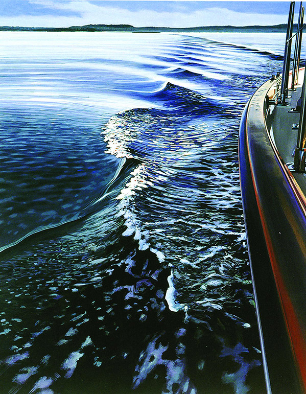
Vinalhaven,  Maine - 1997
In contrast: Without figures to distract me, I can get lost in the rhythm and negative space in this painting. (And the efficient little scribbles he uses for the churning water. I can steal that!)

It wasn't until  he began merging his figures with the environment,  repeating them and distorting them, that they made sense in the context of his storytelling.

Checkout 2012

43rd and Broadway - 2005
  His  few nature scenes also didn't work for me unless there was some introduction of reflection or dramatic composition element. The lack of atmospheric perspective, absence of bold composition and light choices make them much less interesting than his urban landscapes.

So clearly this show was an unexpected gem. It got me looking and thinking.  I really tried to analyze what I was responding to in the work and what I could use. It wasn't just the efficiency of his brushwork or his insane layers of reflection (those are skills that will only come in time). It was also his compositional sensibility. The wide angles and extreme foreground to background relationships between elements to exaggerate and connect distances. The negative space broken up by a sweeping structure or reflection. A subtle hint of texture over the surface to remind the viewer of a barrier.

View of Manhattan from Staten Island - 2008
Look closely at the window. The distant skyline is represented in perfect crispness but for a few subtle strokes of grime on the window reminding the viewer of the separation... Totally stealing that.

Sadly, this show did reinforce one of the biggest drawbacks to photorealist art.  When you see a reproduction, it's very easy to dismiss the work because it just looks like a photo. No big deal.  Even looking at the (beautifully done) book after the show, I had no desire to get it because nearly everything I loved about the paintings were lost in the reproductions. This was art that had to be stood in front of, at eye level, so you could feel yourself being transported into the scene and lost in the detail.

This is also not to say I love all photoreal art now. There is still a lot of bad photoreal art out there that doesn't utilize the tools successfully to share a distinct point of view. (it's especially tricky with figures) What I did take away from this show is that technique must be crafted to suit the subject and story you want to tell. Richard Estes' compositions are often created to put the viewer in right into the environment and drawing them in with sweeping compositional elements to create an intimate, first-person perspective. Unlike the camera or the naked eye, everything is rendered crisp with little to no atmospheric perspective. Everything in the environment is of importance and worth observation. After leaving- I found myself seeing his compositions all around me. I was looking more closely at the world, seeing it in a new way.

I can use that.

Sarasota, Summer 2014


Figurative Friday 3 - Robin Williams


It's a strange thing grieving for celebrities. You think of their families, their friends and wonder what right do I have? Who are we to claim any ownership over the loss of someone we've never met?  And as an artist, what authority do I have to communicate that loss in my language? 

But in our culture of entertainment, there are certain people like Robin Williams who do become family. We grow up with their presence as a constant in our lives. Through the television, film screen and stage, they reach out and help shape us into the people we become. For me and many of my generation, Robin was so much. He was our Genie, our Peter Pan, our doctor, our father figure.  He taught us to laugh at ourselves through alien eyes,  to see homosexual relationships in a very human way, to embrace the weirdness of life and never stop laughing at it. In the way only someone who would make you laugh until you cried could, he taught us that inner darkness was not a thing to hide or ignore.

I am really going to miss all the things that he could have taught and the laughter he would have created.

Figurative Friday 2!

A couple more random figures from the sketchbook. Tilda Swinton inspired study (because Tilda Swinton) and a figure doodle from the imagination that's some sort of cross between the Chiquita banana lady and a jewelry hoarder. 


Intelligent Design


'"Intelligent Design"
oil on cradle board
6 x 6
"When our creations finally became self-aware, few could have predicted how fast the world would change. Unhindered by human limitations, they began to modify themselves and progressed swiftly. The creations developed communities and soon became active in culture: engaging in the workforce, the sciences, gaining political representation. It was not long before they even began experimenting with religion.  We could not comprehend their sacred geometries and our creations soon evolved far past what our limited biology could ever hope to attain.  They curated a culture where every aspect of existence: science, art, spirituality, even fashion was interconnected. We were apes compared to their beauty. So when at last the offer came for us to join them, the human race rushed into extinction with open arms and rejoiced. "

Figurative Friday!

So in honor of Friday I decided to scan a few random figure sketches from the week to share. These are a mix of figures from reference and figures from my head. Fun tip: do an image search for "parkour" and find lots of cool dynamic action shots to sketch.